ShopDreamUp AI ArtDreamUp
Deviation Actions


Suggested Deviants


Suggested Collections


![[Vector #350] Twilight #1](https://images-wixmp-ed30a86b8c4ca887773594c2.wixmp.com/f/559c33ab-9e61-4717-8034-fa69e8fb5e48/ddak228-5d41e093-3a3c-42ec-9b3a-409cced9a254.png/v1/crop/w_184,h_184,x_28,y_0,scl_0.036327739387957/_vector__350__twilight__1_by_suramii_ddak228-92s-2x.png?token=eyJ0eXAiOiJKV1QiLCJhbGciOiJIUzI1NiJ9.eyJzdWIiOiJ1cm46YXBwOjdlMGQxODg5ODIyNjQzNzNhNWYwZDQxNWVhMGQyNmUwIiwiaXNzIjoidXJuOmFwcDo3ZTBkMTg4OTgyMjY0MzczYTVmMGQ0MTVlYTBkMjZlMCIsIm9iaiI6W1t7ImhlaWdodCI6Ijw9NTA2NSIsInBhdGgiOiJcL2ZcLzU1OWMzM2FiLTllNjEtNDcxNy04MDM0LWZhNjllOGZiNWU0OFwvZGRhazIyOC01ZDQxZTA5My0zYTNjLTQyZWMtOWIzYS00MDljY2VkOWEyNTQucG5nIiwid2lkdGgiOiI8PTgxMjAifV1dLCJhdWQiOlsidXJuOnNlcnZpY2U6aW1hZ2Uub3BlcmF0aW9ucyJdfQ.DqrUopI836biwqWCCMXQLNgvdlqtbo9pbLZDgy5rDto)
![[Vector #350] Twilight #1](https://images-wixmp-ed30a86b8c4ca887773594c2.wixmp.com/f/559c33ab-9e61-4717-8034-fa69e8fb5e48/ddak228-5d41e093-3a3c-42ec-9b3a-409cced9a254.png/v1/crop/w_92,h_92,x_14,y_0,scl_0.018163869693978/_vector__350__twilight__1_by_suramii_ddak228-92s.png?token=eyJ0eXAiOiJKV1QiLCJhbGciOiJIUzI1NiJ9.eyJzdWIiOiJ1cm46YXBwOjdlMGQxODg5ODIyNjQzNzNhNWYwZDQxNWVhMGQyNmUwIiwiaXNzIjoidXJuOmFwcDo3ZTBkMTg4OTgyMjY0MzczYTVmMGQ0MTVlYTBkMjZlMCIsIm9iaiI6W1t7ImhlaWdodCI6Ijw9NTA2NSIsInBhdGgiOiJcL2ZcLzU1OWMzM2FiLTllNjEtNDcxNy04MDM0LWZhNjllOGZiNWU0OFwvZGRhazIyOC01ZDQxZTA5My0zYTNjLTQyZWMtOWIzYS00MDljY2VkOWEyNTQucG5nIiwid2lkdGgiOiI8PTgxMjAifV1dLCJhdWQiOlsidXJuOnNlcnZpY2U6aW1hZ2Uub3BlcmF0aW9ucyJdfQ.DqrUopI836biwqWCCMXQLNgvdlqtbo9pbLZDgy5rDto)


You Might Like…


Featured in Groups

Description
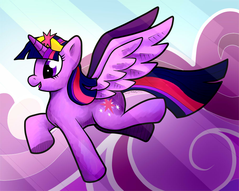
I plan to make this into an autograph card in the next Equestria LA. I'd love to hear any ideas and input. Done on Sai.
Princess Twilight Sparkle (c) Hasbro, DHX and
Edit: I would like to thank Equestria Daily for getting my artwork featured!
Princess Twilight Sparkle (c) Hasbro, DHX and
Edit: I would like to thank Equestria Daily for getting my artwork featured!
Image size
1000x800px 119.13 KB
© 2013 - 2024 BrownWolfFM
Comments4
Join the community to add your comment. Already a deviant? Log In
The first thing that I notice about this piece is the back legs, they don't have hocks and look like they are broken to be quite frank. when drawing appendages you should keep in mind how a real animal might look, and work from that. also, you might benefit from studying what's called a line of action. www.animationresources.org/pic… The only other thing I can complain about anatomy wise is the muzzle. it seems too bulbous for her face and makes her look like a certain green dinosaur that we all know and love *cough*yoshi*cough*
The background itself fits the piece quite nicely actually, but the light streaks going over everything on the canvas creates a negative impact, it's fighting for attention in the piece when clearly twilight is the main attraction here, but the viewer has to look past the light effect to see the centerpiece, the center should never have to fight for control over the viewers attention it's your focal point after all.
And while i'm on the subject of focal point, something that might have helped the piece would be a wider canvas along with moving the focal point farther to the right or left, even slightly up or down. A lot of professional artist will tell you that a centerpiece in an artwork should in fact not be in the center of the canvas. It creates unease in the brain of a viewer, as if something were being shoved in our face. Some talk about trisecting the piece both vertically and horizontally and placing your focal point on one of the 4 places that the imaginary lines (or real lines if you decide to actually draw them for reference.)
One thing I have to compliment you on is your choice of painting, it seems you went with something more akin to water coloring, and the effect achieved in this creates a nice separation between foreground and background.
The last thing I must critique is a suggestion to you personally, your signature is so small we can't read it, don't be bashful with your signature. I personally believe a signature should boldly say "I did this and i'm proud."
I sincerely hope that nobody is offended by anything I've said and that you the artist benefits from my words.